We designed AirAware, a pocket air quality monitor
We’ve just handed in our design project for Human-Computer Interaction at the University of Birmingham. The module teaches human-centred design: ask people at every step, and let their answers change the design. This year’s brief was to design something that helps people take part in fighting climate change.

We followed the Double Diamond: open up to find problems, narrow down to one, then do the same for solutions.
There were five of us, and no official leader. I split the work by what each of us was good at, though in practice it was a mix: one did the designs and the poster, one wrote up the slides, one did the formatting and helped with the research, and one focused on the research. I had a hand in all of it. Everything was decided together, so we all had to be on the same page, and keeping us there ended up being my job: I scheduled the meetings and checkpoints, and passed things along between people. It reminded me of StudySea, our team project in second year. This one had much less code, but it was difficult in a different way, and it was a lot of fun.
Finding the problem
Sixty-two people answered our survey, and of the climate problems we asked about, air pollution and waste worried them most. That told us what worried people, but not why, so we interviewed some of them. The tricky part was not putting words in their mouths: we asked about their own lives, and saved the specific questions for the follow-ups.
One interviewee, an international student with asthma, exercises outside in the UK without thinking about it, but not back home in the Middle East, because there’s no way to tell whether the air is safe that day. We checked: the UK has hundreds of air quality stations, and most countries in the region have a handful. Apple’s Weather app doesn’t show air quality in those countries at all, and Samsung’s isn’t reliable, because it averages the few stations they have. Our survey would never have turned that up, and it’s where AirAware came from.
That interview also showed me how differently people see the same problem. I tend to go by the facts, and I’m happy to take on other people’s views, but on my own I find it hard to get from facts to an idea like that one. Everyone else on the team was better at it than me.
AirAware
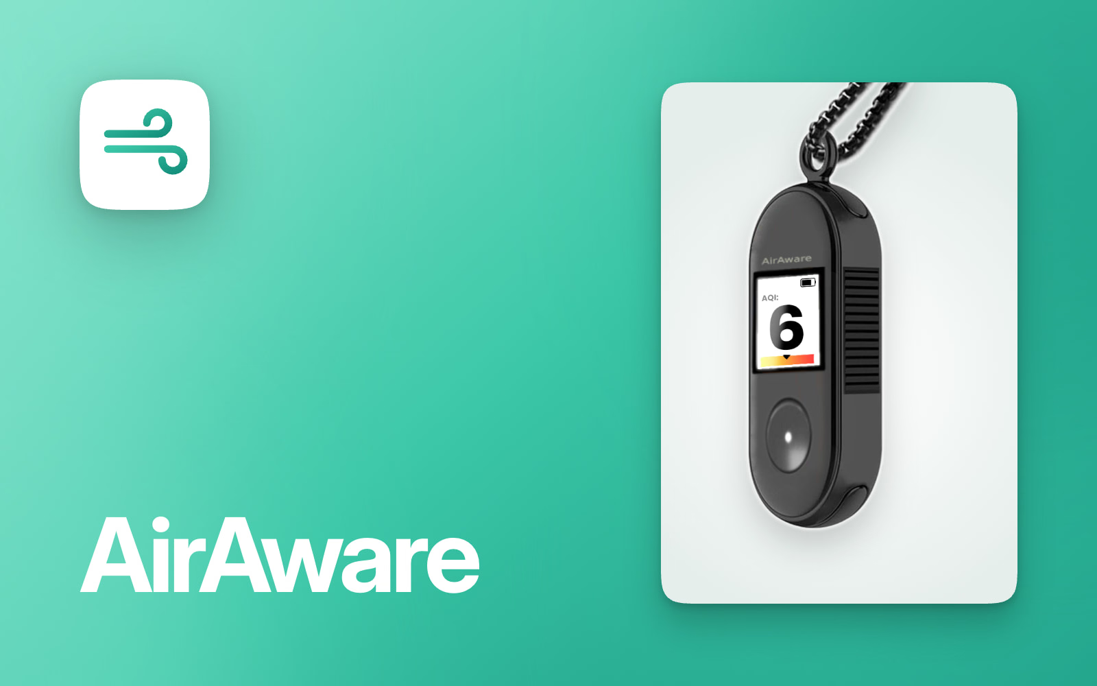
AirAware is a small air quality monitor that goes on a keyring or around your neck. Press the button and it shows the air quality where you are, and it warns you if you’ve been breathing bad air for too long. It syncs with a phone app, and everyone’s readings build up an air quality map where there isn’t one.
Our other idea was a fridge camera, for the other big worry in our survey, food waste. What decided it was the brief: the fridge was more about saving money than the climate.
The name came out of our brainstorming sessions, my favourite part of the project. We wanted alliteration and a rhyme, and AirAware has both.
We showed people a first sketch, then two different versions, and the final design took the best of both, based on what they said.
What people said Too round to hold, the battery and the reading looked too alike, and with nothing to attach it to, your hand covered the vents.
The phone app went the same way. Our first wireframes put every reading on screen at once, and people asked what the numbers meant, and whether they were bad. So the final design, made in Figma, leads with one number on a scale, says what it means, and keeps the details for the history screen.
Our brief was climate change, and AirAware doesn’t cut anyone’s emissions. It’s about awareness: you know what you’re breathing, and every reading adds to the map. The more people carry one, the better the data gets where nobody’s measuring, like back home for the student we interviewed, and the harder bad air is to ignore.